Reference
Pantone colour matching on packaging: what a manufacturer can and cannot hold
A brand picks a Pantone from a fan deck under office light, and months later the box arrives looking almost right. Almost is the problem. Nothing has gone wrong: the number was never a colour, it was a recipe, and a recipe behaves differently on coated art paper, uncoated board, ribbon and foil. This is what actually happens to your colour between approval and delivery, and what to ask a manufacturer before you sign anything off.
By the Luxel Pac team · 7 min read · Updated August 2026
What is a Pantone colour?
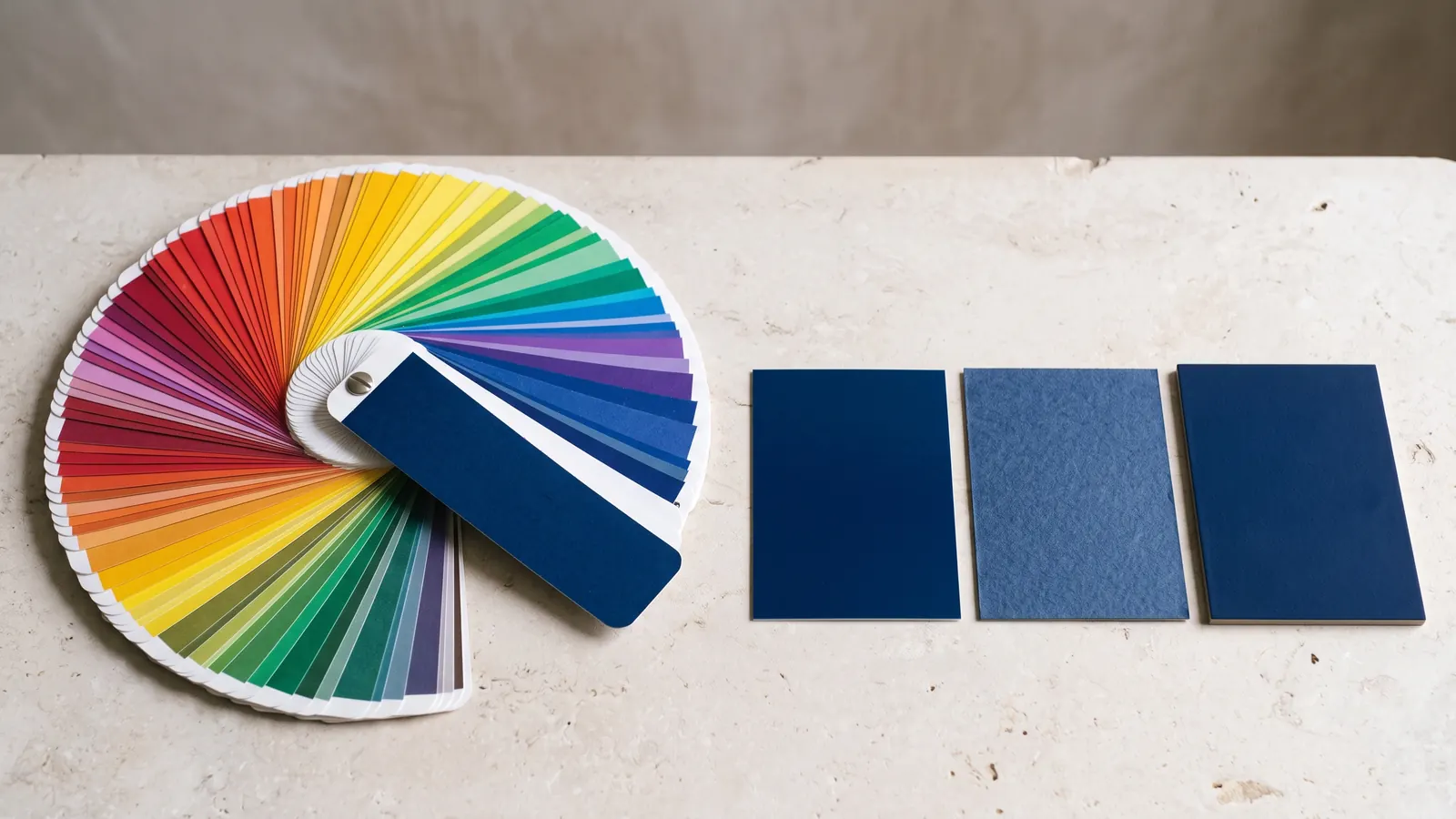
A Pantone colour is a standardised ink recipe, not a shade. Each number specifies which base inks to mix and in what proportion, so a printer in Shanghai and a designer in Paris can reach the same result without ever seeing each other’s work. That is the whole purpose of the system: a shared reference that survives distance.
It matters for packaging because brand colour is the one element a buyer recognises before they read a word. Get it wrong across a range and the products stop looking like a family.
What is a spot colour?
A spot colour is a single pre-mixed ink laid down in one pass, rather than a colour simulated by overlapping cyan, magenta, yellow and black. Pantone colours are spot colours. CMYK builds an approximation from four inks; a spot colour is the actual ink.
The practical difference is consistency and reach. A spot colour is identical on every sheet and every reprint, and it can produce colours CMYK cannot reach at all: deep navies, strong oranges, anything metallic or fluorescent. CMYK will get close to many brand colours and will miss a specific set of them entirely.
| Spot colour (Pantone) | Process colour (CMYK) | |
|---|---|---|
| How it is made | One pre-mixed ink, one pass | Four inks overlaid |
| Consistency across a run | Very high | Varies with press conditions |
| Consistency across reprints | High | Lower |
| Range | Reaches colours CMYK cannot | Cannot hit some brand colours |
| Best for | A brand colour used flat, across a range | Photography, gradients, full-colour artwork |
| Cost effect | Adds an ink station; worth it for brand colour | Standard |
What is the difference between Pantone C and Pantone U?
The same ink on different paper. C is the colour printed on coated stock, U is the same recipe on uncoated. They carry the same number and they do not look the same.
Coated stock holds ink on the surface, so the colour stays saturated and sharp. Uncoated board absorbs it, so the same ink dries lighter, softer and slightly duller. This is physics rather than a fault, and it cannot be corrected by printing harder.
It matters more in luxury packaging than almost anywhere else, because the materials that feel best are often the ones that shift colour most. A soft uncoated board with a beautiful hand will mute your brand colour. If the colour must be exact, choose a coated wrap. If the texture must be right, accept the shift and approve the colour on the actual material rather than from the fan deck.
Why does the printed box not match the swatch?
Five things move it, and only the first is anyone’s fault:
- Substrate. The same ink on coated art paper, uncoated board and kraft gives three different results.
- Lighting. A colour approved under office fluorescents will read differently in daylight and different again under retail spotlights. Ask which light source a proof was assessed under.
- Screen. A monitor emits light, paper reflects it. No screen can preview a printed spot colour reliably, and an sRGB screen cannot display parts of the Pantone range at all.
- Finish. Soft-touch lamination mutes and slightly darkens. Gloss lamination deepens. Spot UV changes how the colour reads where it lands, which is why partial coverage can look like two colours.
- Ageing. A fan deck fades. Pantone recommends replacing books roughly every year, and a five-year-old deck in a sunny studio is no longer a reference.
The fix is not a better screen. It is approving colour on a physical sample of your actual material, with your actual finish, under a named light source.
What is Delta E, and what tolerance should I ask for?
Delta E is the measured distance between two colours. Zero is identical. Around 1 is the threshold where a trained eye begins to detect a difference under controlled light. Roughly 2 to 3 is where most people notice something is off when the two are placed side by side, and above that the difference is plain.
This is the single most useful question to ask a manufacturer, and almost nobody asks it: what Delta E do you hold, measured on my substrate, and will you measure it on the production run rather than only on the proof? A supplier who can answer in numbers is measuring. One who answers "we match Pantone exactly" is not, because exact is not a thing that exists.
Tolerance also depends on where the colour sits. A flat panel shows variance that a small foil-stamped mark never will. Judge the tolerance against the piece, not against the swatch.
What is Pantone TCX and when do I need it?
TCX is the textile library, specified on cotton rather than paper. You need it whenever colour has to carry onto fabric: ribbon handles, satin linings, drawstring pouches, cotton totes.
A paper Pantone and a textile Pantone with similar numbers are not interchangeable, and dyed fabric behaves differently again from printed paper. If a project has a ribbon that must match a printed panel, say so at the briefing stage. Matching across two materials is achievable, but it is a deliberate exercise, and it is far harder to fix once both are in production.
Can any Pantone be printed on packaging?
Most, not all. Metallics, fluorescents and some very saturated colours need specific inks and sometimes a specific substrate, and a few will not reproduce faithfully on an absorbent uncoated board whatever the press.
Foil is a separate matter entirely and it catches people out. Hot foil is a metallic film, not an ink, so it is chosen from a foil range rather than a Pantone book. A gold foil cannot be specified as a Pantone number and asking for one will produce a polite email rather than a match.
What this costs
A spot colour adds an ink station on press, so it carries a cost, but on a luxury piece it usually sits alongside the finishes rather than dominating the quotation. For context, each finish on a box typically adds 5 to 10 percent to unit cost, and colour matching behaves similarly.
The expensive version of this is not the ink. It is a reprint because a colour was approved on screen, or a launch that slips because the ribbon and the box did not match. A physical pre-production sample takes 7 to 10 days and removes both risks.
What to ask before you approve
- Which Pantone, in which library, and is it specified C or U?
- On which substrate, and can I see it on that exact board rather than a house sample?
- What Delta E tolerance do you hold, and is it measured on the production run?
- Under what light source was the proof assessed?
- What does the finish do to it? Ask specifically about soft-touch, which mutes.
- If there is ribbon or fabric, which TCX reference, and has anyone checked it against the printed panel?
- How old is the fan deck this was matched against?
We supply a physical pre-production sample on the actual material and finish before any production run, because colour is the one thing that cannot honestly be approved from a screen. Our own guide to luxury packaging manufacturers by region covers how to compare suppliers more broadly.